How to Use Histograms and Box Plots to Visualize Data Distributions
When You Care About Shape, Not Just Comparison
Bar charts do one job really well: they let you compare categories. But what if your data doesn't fit into neat categories? What if you're working with heights, temperatures, exam scores — continuous data where you want to understand the whole distribution? Where's it bunched up? How spread out is it? What does the overall pattern look like?
That's when you need to shift tools. Enter the histogram and the box plot.
The key difference: bar charts answer "how do these categories rank against each other?" Histograms and box plots answer "what does this data actually look like as a whole?" It sounds like a subtle shift, but it changes everything about how you visualize and think about your numbers.
Histograms: Seeing the Shape
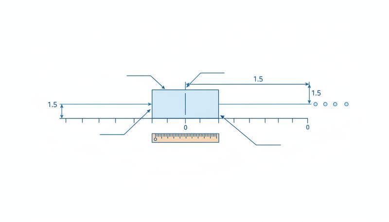
A histogram looks like a bar chart. If you glance at it sideways, you might think they're cousins. But they're doing something fundamentally different. Instead of one bar per category, a histogram shows how many values pile up in each chunk (or "bin") of your continuous variable.
How Histograms Work: A Step-by-Step Process
Let me walk you through building one — and understanding the mechanics really helps when you're staring at one later:
-
Identify your continuous variable — this needs to be numerical and not boxed in by a fixed set of categories. Heights, test scores, house prices, reaction times? Perfect. Favorite colors, T-shirt sizes, customer regions? Nope.
-
Determine the range — find your minimum and maximum values. If your height data runs from 155 cm to 195 cm, you know your bins have to span that 40 cm interval.
-
Choose a bin width — how wide should each interval be? For heights, maybe 5 cm bins makes sense: 155–160 cm, 160–165 cm, 165–170 cm, and so on. This choice is critical, and honestly, somewhat subjective. More on that in a moment.
-
Count the frequency in each bin — go through your data and tally how many values fall into each interval. That person who's 158 cm tall? They go in the 155–160 cm bin.
-
Draw bars with heights equal to the counts — and here's the key difference from bar charts: in a histogram, the bars touch each other because the underlying variable is continuous. The y-axis usually shows either frequency (raw count) or relative frequency (percentage).
The result is a picture of your data's distribution — its shape. And suddenly you can see things that numbers alone would hide:
- Where the data concentrates (the tallest bars)
- How scattered or tight the data is
- Whether it's symmetric or lopsided
- Whether there are unexpected gaps or multiple bumps
The Bin Width Problem: Not Obvious, But Crucial
Here's where histograms get tricky: bin width is a critical design choice, and getting it wrong can completely hide what your data is trying to tell you.
Too few bins (too wide): Let's say you're looking at exam scores and you only make two bins: 0–50 and 50–100. You've just destroyed all your detail. Everything becomes one blob. You'd have no idea if scores clustered near 45 or near 95 — both would vanish into the same bar.
Too many bins (too narrow): Now flip it. For the same exam scores, you make bins of 0.5 points each: 0–0.5, 0.5–1, 1–1.5, and on and on. If you have 100 students, most bins sit empty, and your chart looks like a spiky, jagged mess — noise drowns out the signal. It looks chaotic instead of meaningful.
The truth: there's no universal "right" answer. You usually have to try a few bin widths before one clicks. A decent starting point: aim for somewhere between 5 and 20 bins for most datasets. Then experiment. A lot of tools let you adjust bin width interactively — seriously, play with it. It's worth the time.
Why Histograms Reveal Hidden Patterns
Here's where histograms get genuinely cool — they can show you things that no single summary number would ever hint at. Real example: researchers looked at tip amounts in restaurants and calculated the average: around $2.50. Pretty straightforward. But when they drew the histogram, something interesting popped out — visible peaks at exactly $1, $2, $3, $4, and $5. Customers were rounding their tips, clustering at whole dollar amounts. The mean? The median? They told you nothing about this behavior. Only the histogram revealed it.
This is why digging into the actual shape of your data — before you summarize it down to one lonely number — is so valuable. It's called exploratory data analysis, and it's one of those underrated skills that separates people who understand their data from people who just quote statistics.
Box Plots: The Five-Number Summary in Visual Form
A box plot (sometimes called a box-and-whisker plot) is a more compact way to show a distribution. It's based on the five-number summary we talked about earlier, just in visual form.
Anatomy of a Box Plot
Here's what you're looking at:
- The box itself stretches from Q1 to Q3 (the interquartile range) — that middle 50% of your data living in one rectangle.
- The line inside the box is your median (Q2), the dead center of everything.
- The whiskers (those lines extending out from the box) reach to the most extreme values that are still within 1.5 × IQR of the box edges. John Tukey, the statistician who invented box plots, picked that 1.5 × IQR formula deliberately — it flags unusual points without going overboard.
- Dots scattered beyond the whiskers are outliers — values so extreme they've fallen outside the 1.5 × IQR zone.
Why Box Plots Excel at Comparison
Here's what makes box plots special: they're built for comparing distributions across multiple groups at once. You can line up 10 box plots side by side — one for each department, school, or region — and take it all in. Try doing that with 10 histograms and your audience will tune out.
Real example: A company wants to see salary ranges across 7 departments. You draw one box plot per department, arrange them left to right, and boom — instantly visible: Which departments pay more on average? Where's there more salary spread? Which departments have weird outliers? You could spend paragraphs describing this, or show multiple histograms, but a single row of box plots says it all at a glance.
Another one: An education researcher compares test scores across 5 schools. Box plots show not just the average but the spread, consistency, and whether any school has unusually high or low scores. That's comparative analysis at its best.
The Trade-Off: Simplicity vs. Detail
The catch: box plots are tidy and compact, but they gloss over the detailed shape of your distribution. Here's the crucial limitation: a unimodal distribution (one peak, like a bell curve) and a bimodal distribution (two peaks, like a camel) can look identical as box plots. The five-number summary just doesn't capture whether there are multiple peaks hiding inside.
Imagine two test-score datasets: one where scores bunch around 70%, another where they split into two clusters at 50% and 85%. Both could have the same median (say, 72%), same IQR, same whisker length — they'd be identical box plots. But the shape? Totally different. If understanding that shape matters to your analysis, histogram. If you need to compare multiple groups side by side, box plot.
Histograms and Box Plots in Tandem
Here's what the pros do: use both. Not one or the other, but both.
Reach for a histogram when:
- You're digging into a single variable and want to understand its true shape
- You're hunting for multiple peaks, skewness, or weird patterns
- Your audience needs to see the granular structure
- You want to know where the data actually clusters
Reach for a box plot when:
- You're comparing distributions across multiple groups
- You need something compact and easy to read
- Spotting outliers is important
- Your audience already knows what quartiles are
Use both when:
- You're doing thorough analysis and want both the detailed picture and the comparative view
- You want to double-check that what you see in the histogram aligns with what the five-number summary suggests
A histogram tells you what the shape looks like. A box plot tells you where it sits and how it stacks up against others. Together, they're complete.
Histogram vs. Box Plot: A Decision Guide
| Question you're asking | Better chart |
|---|---|
| What's the shape of this distribution? | Histogram |
| Are there multiple peaks? | Histogram |
| How does this distribution compare to 5 others? | Box plots |
| What are the outlier values? | Box plot |
| Where is most of the data concentrated? | Either |
| What are the quartile values precisely? | Box plot |
| Is the distribution symmetric or skewed? | Histogram |
| Which group has the smallest spread? | Box plots |
In the real world, solid analysts use both — a histogram to understand a single variable deeply, and box plots to see how that variable shifts across different groups. It's not either/or. It's contextual. Let your question guide your choice.
Only visible to you
Sign in to take notes.