How Buildings Use Space as Language
The Language of Space
If you had to name the single most important thing architects work with, the answer might surprise you. Not concrete. Not glass. Not steel or timber or brick. The primary material of architecture is space — and specifically, the way that space is shaped, enclosed, revealed, and experienced.
The Void Is the Point
The architect Louis Kahn put this most provocatively when he said that "the room is the beginning of architecture." Not the wall, not the column, not the facade — the room. The space enclosed. The void within.
Here's a useful way to think about it: imagine a sculpture versus a building. A sculpture is an object you walk around and look at. A building is an object you walk into — and once you're inside, the sculpture ceases to matter and the space takes over. The most beautiful exterior in the world doesn't guarantee a beautiful interior. And the most magnificent interior can lurk behind an unassuming facade (think of the Pantheon in Rome, whose plain exterior gives no hint of the dramatic rotunda waiting inside).
This distinction touches on something fundamental about how humans move through the world. When you encounter a painting, you stand outside it. When you encounter architecture, you don't stand outside it — you move through it, around it, and crucially, within it. Your body becomes the measure of the space. Your sightlines shift as you walk. Your sense of the interior transforms based on where you're standing, what time of day it is, how light falls through windows. Architecture unfolds over time as you navigate it — it's a temporal art in a way that sculpture simply isn't.
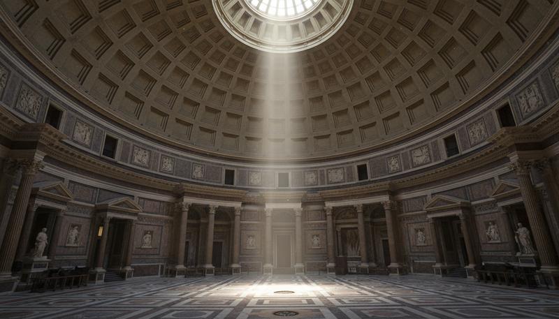
The ancient Roman Pantheon is the masterclass here. From outside, it's a classical portico attached to a cylindrical drum — impressive, but not astonishing. Then you step through the bronze doors and everything changes. You're inside a perfect sphere: a domed rotunda 43.3 meters in diameter and exactly 43.3 meters from floor to the top of the oculus. The dome's geometry means that a complete sphere could fit perfectly within the room — the floor is the equator, the dome the upper hemisphere. At the very top, a circular opening nine meters across lets in a beam of light that moves through the interior throughout the day like the world's most magnificent sundial.
Think about what that does to you, standing inside. That hole in the ceiling quite literally connects you to the sky above — to weather, to the passage of time, to the cosmos itself. On a cloudy day, you see gray. On a clear night, you see stars. On a sunny afternoon, that shaft of light becomes almost tangible, visible through the dust floating in the air. The building isn't showing you the sky through a window; it's making the interior of the building an extension of the exterior world. The distinction between inside and outside blurs. This is why the oculus matters more than any structural consideration — it makes what could otherwise feel like a vault feel instead like an open-air room roofed only by the heavens.
The space is the experience. The walls are just what make that space possible.
Enclosure, Threshold, and Sequence
Here's how architects actually think about buildings: not as a collection of isolated rooms, but as a sequence of spatial experiences. The question isn't just "what is this room like?" but "how do you get here? What do you see just before you enter? How does crossing the threshold change your sense of yourself and your relationship to the building?"
The threshold — that moment of crossing from one spatial condition to another — is one of the most powerful tools in architectural thinking. Imagine the difference between walking directly into a bright, open space versus approaching it through a dark, compressed corridor that suddenly opens up. The compressed approach makes the arrival a revelation. The spatial sequence has rhythm — and rhythm creates meaning.
Understanding Thresholds in Practice
A threshold isn't just a doorway. It's a moment of transition between two distinct spatial states. When you pass through it, several things might change at once: the light quality shifts, the ceiling height changes, the air temperature adjusts, even the way sound behaves in the room transforms. The floor material beneath your feet sends a different message. Collectively, these cues prepare your mind and body for a different kind of experience.
Consider a classical Japanese temple entrance: you step up onto a wooden platform (the genkan), remove your shoes, and immediately something fundamental has changed — not just spatially, but psychologically and even spiritually. Your bare feet touching the smooth wooden floor communicate directly to your nervous system that you've entered a different realm. Nothing about this sequence is accidental. The threshold signals a shift from the profane (everyday) to the sacred (ceremonial).
Walk into a museum and you feel it instantly: the change from street noise to hushed interior calm, from bright daylight to carefully controlled gallery lighting, from bustling crowds to meditative solitude. All of this happens at the threshold. Museums depend entirely on this effect; without it, the art inside would feel like more visual noise from the outside world, just another thing competing for your attention.
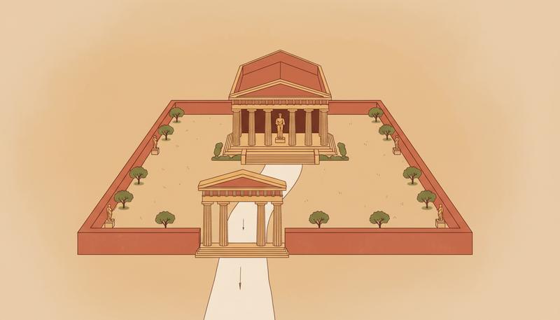
The ancient Greeks understood spatial sequencing brilliantly. The approach to the Acropolis in Athens is a carefully choreographed journey: you climb the hill, compressed by the slope; you pass through the Propylaea (the monumental gateway), which frames a view of the Parthenon; then you emerge onto the plateau and the full scale of the temple hits you all at once. The building wasn't designed to be experienced from a single viewpoint — that would be like watching a film where the camera never moves. Instead, the Acropolis was designed to be experienced in motion, over time, through a series of spatial compressions and expansions that prepared you emotionally and psychologically for the sacred space at journey's end.
This principle of processional architecture — designing a sequence of arrival rather than a static image — shows up in nearly every major architectural tradition. Medieval cathedrals conceal their interiors; you can't know what's inside from the exterior. You enter through the narthex (a semi-public transitional space), then cross into the nave. As your eyes adjust to the interior dimness and the shafts of colored light from stained glass gradually reveal themselves, the soaring vertical space slowly unfolds. By the time you reach the crossing (where the nave and transept intersect), usually aligned with the apse and altar, you've been prepared by this spatial journey for a moment of culmination.
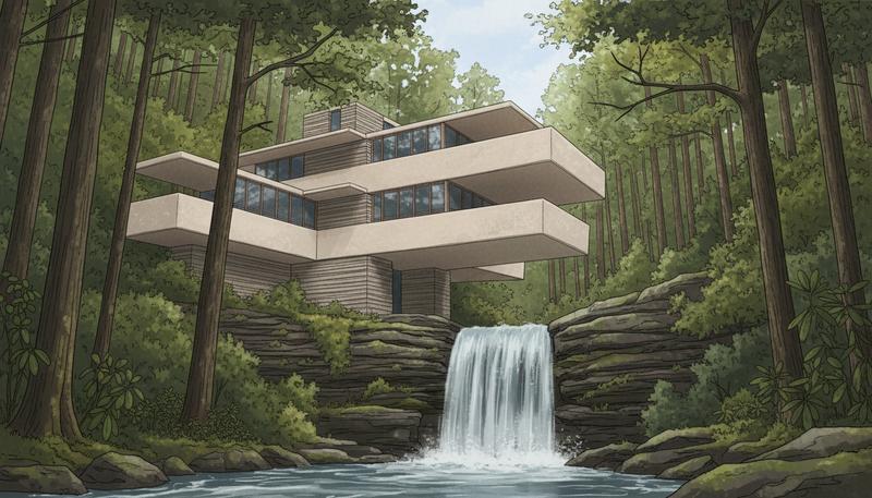
Frank Lloyd Wright was obsessed with spatial sequence and the threshold. His houses famously compress the entry — low ceilings, narrow corridors, dark thresholds — before releasing visitors into the main living space with dramatic changes in ceiling height, light, and view. This isn't arbitrary design choice. Wright believed that you cannot truly appreciate an open space unless you've been confined first. The confinement amplifies the relief of opening. It's pure psychology, expressed through architecture.
Walking into Fallingwater, his legendary 1936 house over a waterfall in Pennsylvania, follows exactly this choreography: a winding approach through trees, a low-ceilinged entrance, and then the explosion of the main room opening onto cantilever balconies over the stream. Once inside that main room, with its extensive glazing and open floor plan, the spatial generosity feels not just pleasant but almost profound — because you've been prepared for it by the compression of arrival.
Rhythm and Spatial Pacing
Music has rhythm — a pattern of emphasizing certain beats and de-emphasizing others. Architectural sequences have rhythm too. A well-designed museum doesn't present all its masterpieces in rapid succession; galleries alternate between expansive halls and intimate chambers. A well-designed street doesn't swing between complete openness and complete closure; arcades provide shelter, small plazas offer pause, the street widens or narrows to change the pace.
This rhythm controls how quickly or slowly you move through a space, and how long you're likely to linger. Compressed corridors make you move faster; they feel purposeful. Open plazas make you slow down and notice details. Architects who understand rhythm guide behavior subtly — not with signs or barriers, but through spatial design alone.
Scale, Proportion, and the Body
Space has absolute dimensions — you can measure it in meters. But space is always experienced relative to the human body, and this is where architecture becomes something more intimate and personal. Architects are obsessed with the human figure as a measuring device because how a space feels depends entirely on how your body relates to it.
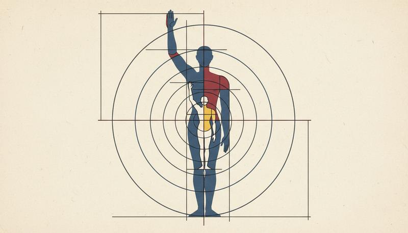
Vitruvius, the ancient Roman architect and theorist, described ideal architectural proportion in terms of the human body. During the Renaissance, this principle got revived and systematized — the idea that a building's proportions should echo human proportions, that harmony emerged from this correspondence. Le Corbusier took this further, inventing the "Modulor" — a proportional system based on the idealized dimensions of a six-foot-tall man with his arm raised. He used this system to design not just individual buildings (like his Unité d'Habitation housing complex) but entire modular systems of construction.
The Japanese approached this differently, developing the tatami mat as a unit of measurement — originally based on the floor space needed for one sleeping human body. Traditional Japanese rooms are still measured in mat units, so a "6-mat room" immediately communicates to anyone familiar with the system exactly what size room is being discussed, without needing to convert meters. The body remains the reference point.
Scale Operates at Multiple Levels
Absolute scale refers to the objective dimensions of a space — a ceiling that's 40 meters high is objectively tall. You can measure it. But relative scale refers to how that space feels in relation to the human body entering it, and this matters far more for how we actually experience architecture.
A room with a 3-meter ceiling feels "normal" because we're about 1.7 meters tall, so the ceiling is roughly twice our height — a comfortable proportion for an inhabited space. A room with a 6-meter ceiling feels grand, almost ceremonial, because the ceiling is now four times our height. A room with a 1.5-meter ceiling feels claustrophobic, not because it's objectively low, but because it's lower than our heads — our body can't fully extend into the space above.
Gothic cathedrals exploit relative scale relentlessly: their vaulted ceilings at 30+ meters make the human figure feel microscopic, and this is entirely deliberate. The theological and political point of a cathedral was explicitly to make you feel small before God and the power of the Church. You enter as an individual and become part of a mass of humanity beneath an impossible height. The space deliberately diminishes you.
Corporate headquarters do something similar in their grand lobbies: the soaring atrium communicates wealth, ambition, and permanence — and makes you feel, however subtly, like a visitor or subordinate in someone else's domain. The scale says, "We are big. You are small. You are temporary here." This is the language of power, expressed through spatial scale.
Domestic architecture works the opposite magic: the well-designed home brings ceiling heights down to what architects describe as feeling "inhabited" — typically 2.4–3.0 meters for living spaces — because the goal isn't to inspire awe but to create intimacy. In your home, you're not supposed to feel small or temporarily displaced. Your body should feel held by the space rather than dwarfed by it. A 2.4-meter ceiling is just high enough that you don't feel cramped, but low enough that the space feels like it belongs to you, like you fit into it naturally.
This explains why a massive open-plan loft with 5-meter ceilings often fails as a home despite being objectively impressive. The scale is grand but the intimacy is missing. Without enough architectural elements to divide the volume into smaller, body-scaled zones, the inhabitant often feels lost rather than at home.
Positive and Negative Space
Architects also think in terms of positive and negative space — a concept borrowed from visual art and fundamental to spatial understanding. In two-dimensional design, positive space is the figure (the shape you actually see) and negative space is the ground (the space around it). Flip your perception and they reverse instantly: the figure becomes the ground, and what you thought was empty space becomes the shape.
In architecture, positive space is the mass of the building — the walls, columns, floors, material substance. Negative space is the void: rooms, corridors, courtyards, arcades, plazas. Here's the revolutionary insight: the negative space can be designed just as deliberately as the positive. Most people think buildings are about the stuff you see — the walls, the facade, the structural elements. But master architects know that buildings are equally about the emptiness within and around them.
Shaped Voids and Urban Memory
Rome's Piazza Navona occupies the exact footprint of Domitian's ancient stadium — a void that dates to the first century CE. For nearly two thousand years, the stadium's athletic track has been preserved not by the track itself (that's long gone) but by the buildings surrounding it. The buildings became the mold; the piazza became the casting. Walk around Piazza Navona today and you're walking the same oval path that Roman athletes and spectators walked two millennia ago.
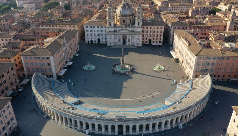
This is a profound example of negative space as spatial memory. The void was shaped deliberately, maintained religiously, because it meant something. The oval isn't accidental geometry — it's history preserved in emptiness.
This principle extends to how we design cities and neighborhoods today. A great plaza — think of Barcelona's Plaça Reial or Venice's Piazza San Marco — feels deliberate and purposeful not because of the buildings surrounding it (though they matter) but because someone shaped the void with intention. The plaza is a positive presence, not just leftover space. There's careful attention to proportions, to how the buildings frame the open space, to how shadows fall at different times of day, to where people naturally gather or pause.
Contrast that with badly designed urban spaces — parking lots or the spaces left between brutalist office towers. These voids were what remained after the buildings were placed, rather than being designed as positive spatial presences in their own right. No one shaped the emptiness. No one asked, "How should people experience this void? What should they feel here?" The space feels accidental and uncomfortable, like a mistake or a leftover, and people stay only as long as they must before leaving.
The Relationship Between Positive and Negative
Understanding this relationship reveals something crucial about how architects think. They don't just place buildings on sites; they shape the space around the buildings with the same care they give to the buildings themselves. This is why the best architectural masterplans are sometimes almost as much about open space as about structures.
In many East Asian traditions, this principle appears in the design philosophy of gardens and temples. A Japanese garden might contain far more void than solid — carefully raked gravel, empty water surfaces, open views — yet those voids are precisely designed. Where you step, what you see from each vantage point, how the negative space flows from one area to the next: all deliberate. The gardener is sculpting the emptiness.
This invites an important reframing: space is not the absence of architecture. Space is what architecture shapes and contains. The wall doesn't matter; what matters is the room that the wall makes possible. The plaza doesn't exist because the buildings failed to occupy it; the plaza exists because the buildings created it, defined it, bounded it, gave it meaning.
Key Takeaways
- Space is the primary material of architecture, not materials like concrete or steel
- Thresholds and sequences guide how we experience buildings over time
- Scale is relative to the human body, not just objective measurements
- Negative space (the voids) is designed as deliberately as positive space (the mass)
- Great architecture shapes emptiness as intentionally as it shapes structure
Only visible to you
Sign in to take notes.