Pivot Tables for Data Analysis: No Formulas Needed
Pivot Tables: Instant Multidimensional Analysis Without a Single Formula
That clarity of "which tool for which job" is the analyst's superpower. And you've just developed half of it: the ability to write a formula that answers one specific, static question about your data — total revenue for the West region in Q3, average deal size by tier, count of Enterprise customers per rep. SUMIFS, AVERAGEIFS, and their cousins are precision instruments. They confirm what you already want to know.
But what happens when you don't know what you want to ask yet? What if you need to see sales by region, product, and quarter all at once — not in three separate formulas, but in a single, reorganizable view? What if you need to swap rows and columns, drill into one product, then instantly zoom back out to see the whole picture? That's where the second half of your superpower comes in: the pivot table.
Pivot tables are where exploration meets confirmation. They're the tool that transforms your tidy, clean data into a dynamic aggregation engine — one that doesn't just answer your question, but answers every variation of it you haven't thought to ask yet. And because you've built the foundation correctly (clean data, consistent types, real dates, proper structure), the payoff is immediate. Here's how they work.
graph TD
A[Source Data Table] --> B[Pivot Table Engine]
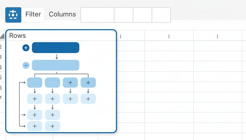
B --> C[🔲 Rows<br/>Groups the data vertically]
B --> D[📊 Columns<br/>Groups the data horizontally]
B --> E[∑ Values<br/>What gets calculated]
B --> F[🔽 Filters<br/>Restricts what's included]
Rows — Fields dropped here become the left-hand labels that run down the table. If you drop "Region" into Rows, you get one row per region. Drop "Region" and then "Salesperson" and you get a hierarchical breakdown: each region expands to show its salespeople. Rows create your vertical categories.
Columns — Fields here create column headers that run across the top. Drop "Quarter" into Columns and your table spreads out horizontally, one column per quarter. Rows and Columns together create the X/Y grid of your table — the two dimensions along which you're cross-tabulating.
Values — This is the number that lives in each cell of the table. By default it usually tries to Sum a numeric field, but you have fine-grained control over what calculation it performs (more on this in the next section). No Values, no numbers — you just get a count of rows.
Filters — Fields here don't change the table's structure; they add a dropdown above the table that lets you include or exclude values. Drop "Country" into Filters and you get a "Country: (All)" selector at the top — flip it to "Germany" and the entire table instantly recalculates showing only German data.
A common beginner mistake is trying to put everything in Rows. If you have five categorical fields and you put all five in Rows, you end up with a very long, nested table that's honestly painful to read. Think strategically about which field belongs horizontally (Columns) — usually something with a few, balanced categories like Quarter or Year — and which belongs vertically. That choice between rows and columns is more important than it looks.
Building Your First Pivot Table: A Walkthrough
Let's say you have a sales dataset — one of the cleanest possible examples. Each row is one transaction, and you have columns: Date, Salesperson, Region, Product, Units, Revenue. Properly structured, no merged cells, real dates, consistent text values. In other words: tidy data.
Step 1: Click anywhere inside your data. If it's formatted as an Excel Table (which it should be, based on Section 6), you're already in good shape.
Step 2: Insert → PivotTable. Excel will ask where your data is (it should auto-detect) and where to put the pivot table. Put it on a new sheet — keeping source data and analysis separate is good practice. Click OK.
Step 3: The PivotTable Fields pane appears on the right. You'll see all your column headers listed as available fields. The four zones appear below.
Step 4: Build your first view. Drag Region to Rows. Drag Revenue to Values. You've just created a pivot table showing total revenue by region. That's it. That's the whole thing.
Step 5: Add a dimension. Drag Quarter (or Date — we'll discuss grouping shortly) to Columns. Now you have revenue by region and by quarter, in a clean cross-tab. A SUMIFS approach would require you to write a separate formula for every cell in that matrix. The pivot table generated the whole thing instantly.
Step 6: Explore. Swap Region for Product. Add Salesperson to Rows below Region. Move Quarter from Columns to Filters. Every rearrangement takes two seconds and generates a completely different analytical view.
Tip: If your column headers are missing, duplicated, or merged in the source data, the pivot table will break immediately. This is exactly why the data discipline from earlier sections pays off here — clean structure means instant results.
Value Field Settings: The Calculator Behind the Numbers
When you drop a field into Values, Excel makes a guess about what calculation to use. For numeric fields it usually guesses Sum; for text fields it defaults to Count. Excel provides 11 primary summary functions available for pivot table value field settings (Sum, Count, Average, Max, Min, Product, Count Numbers, StdDev, StdDevp, Var, Varp), and choosing the right one is an analytical decision, not a default.
To access Value Field Settings: right-click any number in the Values area → "Value Field Settings" (Excel) or click the field in the Values zone → "Summarize by" (Google Sheets).
Sum — Adds up all the values. Right for revenue, units sold, hours logged. This is what you want most of the time for additive metrics.
Count — Counts how many rows match. Right for "how many transactions?" or "how many customers?" Note: Count counts rows, so even a blank cell counts if the row exists. Use Count Numbers to count only non-empty numeric cells.
Average — The arithmetic mean. Right for things like average order size, average rating, average time to resolution. Be careful: averages of averages are mathematically wrong, which is a topic for another day.
Max / Min — Useful for "what was the largest single sale?" or "what's the earliest date in this category?"
% of Total — This is where it gets interesting. Under "Show Values As" (a separate tab in Value Field Settings), you can display each cell as a percentage of the row total, column total, or grand total. This is how you answer "what fraction of total revenue came from the North region?" without writing a single division formula.
You can add the same field to Values multiple times with different settings. Drop Revenue in twice — once as Sum, once as % of Grand Total — and you get side-by-side absolute and relative views of the same data. This is extremely useful for presenting data to stakeholders who want both the "how much" and the "how big a slice" questions answered at once.
Grouping Dates: Where the Investment in Real Dates Pays Off
Remember the emphasis on storing dates as actual date values, not text strings like "March 2024" or "Q1"? This is the moment that investment pays its biggest dividend.
When you drop a date field into Rows or Columns in Excel, it will often automatically group those dates into Years, Quarters, and Months — creating a hierarchy you can expand and collapse. A field with 365 daily values becomes three levels: Year → Quarter → Month. Click the "+" next to a year to drill into its quarters; click again to see individual months.
If Excel doesn't auto-group, or if you want to control it manually: right-click any date value in the pivot table → Group → choose your grouping intervals.
Why this only works with real dates: If you stored "January 2024" as text, Excel sees a list of strings. It can't group strings chronologically — it can only sort them alphabetically, which puts "April" before "March." The pivot table has no idea those strings represent time. Real date values, stored as Excel date serials, give the grouping algorithm actual chronological meaning to work with. This is one of the clearest examples of how data structure governs analytical capability.
Grouping numbers into buckets works similarly. If you have an Age column or a Price column, right-click any numeric value → Group → set a start, end, and interval. Age 0-100 in steps of 10 gives you age bands: 0-9, 10-19, 20-29, and so on. Price 0-1000 in steps of 100 gives you price tiers. This is a remarkably fast way to create histograms and distribution analyses without any additional data manipulation.
Calculated Fields: When You Need a Metric That Doesn't Exist
Your source data has Revenue and Units. You want to see Average Revenue per Unit in your pivot table — which is Revenue / Units. But that column doesn't exist in your data.
Enter the calculated field. In Excel: PivotTable Analyze tab → Fields, Items & Sets → Calculated Field. Give it a name, write a formula using your existing field names, and click Add. The calculated field appears in your field list like any other field — you can drop it into Values and it behaves like a real column.
Here's the important thing to understand: a calculated field operates on the aggregated totals, not on individual rows. When you write = Revenue / Units, the pivot table calculates total Revenue for each cell, total Units for each cell, and then divides those totals. This is generally what you want for a "rate" metric, but it's different from averaging the per-row ratios. The distinction matters for metrics like profit margin, where dividing total profit by total revenue gives a different (and usually correct) answer than averaging the row-level margins.
Warning: Calculated fields divide by the aggregated total, not the row-level values. For most rate metrics this is correct, but for weighted averages or margin calculations, verify that the math matches your intended definition.
Filtering a Pivot Table: Three Approaches
There are three distinct ways to filter what a pivot table shows, each with different trade-offs.
The Filter zone — Fields dropped here appear as dropdown selectors above the table. This is best when you want the filter to be visible and explicitly labeled ("Showing: Country = Germany"). It's also useful for creating a "master filter" that your stakeholders can flip without touching the pivot table structure.
Label filters and value filters — Right-click a row or column label → Filter. Label filters let you narrow by the label text (e.g., show only regions that contain "North"). Value filters let you narrow by the calculated value (e.g., show only rows where Revenue > 50,000). Value filters are powerful for "top N" analysis: Filter → Top 10 → Top 5 Items by Revenue gives you your five best-performing categories, no matter what data changes underneath.
Manual selection — Click the dropdown arrow next to any row or column header, uncheck items you don't want. Simple but fragile — if new categories appear in your source data on refresh, they won't automatically be included.
Slicers: Pivot Tables for a Real Audience
Slicers are what happen when you want your pivot table to be used by someone who didn't build it — a manager, a client, a colleague who gets nervous around Excel.
A slicer is a visual button panel connected to a pivot table. Each button represents one value in a filtered field. Click "Q2" to show Q2 data. Click "North" to show the North region. Click multiple buttons while holding Ctrl to show multiple values. Click the clear icon in the corner to show everything again. No dropdowns, no right-clicking, no "how do I use this?"
To add one in Excel: PivotTable Analyze → Insert Slicer → select which fields you want slicers for. Style them in the Slicer tab so they match your color scheme.
The real power: one slicer can control multiple pivot tables simultaneously. Right-click a slicer → Report Connections → check all the pivot tables it should control. Now a single button click filters every table and chart on your dashboard at once. This is the foundation of interactive reporting without any code.
Pivot Charts: Analysis That Reshapes With Your Data
A pivot chart is a regular chart that's connected to a pivot table instead of a static data range. When you rearrange the pivot table — add a field, change the grouping, filter to a different time period — the chart updates automatically to reflect the new view.
Insert one via PivotTable Analyze → PivotChart, or highlight your pivot table and use Insert → Chart. The chart type choices are the same as regular charts, with one exception: scatter plots and bubble charts don't work directly with pivot tables in most versions because they require numerical X values, not category labels.
The practical benefit is that a pivot chart eliminates the most common dashboard maintenance problem: the chart and the data getting out of sync because someone updated one but not the other. They're permanently linked.
One note on formatting: pivot charts have "field buttons" overlaid on them — small dropdowns that let you filter directly on the chart. They're useful for building, but distracting for presentation. Right-click → Hide All Field Buttons if you're displaying this to an audience.
Refreshing Pivot Tables: The One Thing That Doesn't Happen Automatically
Here's the thing that trips up nearly everyone the first time they use pivot tables in a real workflow: pivot tables do not automatically update when your source data changes.
Add fifty new rows to your sales data. Your pivot table still shows the old totals. This isn't a bug — it's a design choice, because recalculating on every keystroke would be expensive for large datasets. But it means you have to explicitly tell the pivot table to refresh.
Right-click anywhere in the pivot table → Refresh. Or PivotTable Analyze → Refresh. The keyboard shortcut to refresh a pivot table in Excel is Ctrl+Alt+F5, not Alt+F5 alone. (Alt+F5 typically minimizes the window in Excel.) You can also right-click and choose "Refresh All" to update every pivot table in the workbook at once.
Automating the refresh: If your data lives in an Excel Table (and it should), the pivot table's data range automatically expands as you add rows — so at least you don't have to redefine the source range. For automatic refresh on open, right-click the pivot table → PivotTable Options → Data tab → check "Refresh data when opening the file." This is useful for files that pull from external data sources.
For users who want full automation, VBA can trigger a refresh on any event, but that's beyond the scope of this course. For most use cases, a habit of hitting Refresh when you've updated data is sufficient.
Tip: If your pivot table has a "Data Source Range" that ends at row 500 and you've now added row 501, no amount of refreshing will pick up the new row. This is why formatting your source as an Excel Table first (Section 6) matters — the Table range grows automatically.
GETPIVOTDATA: Pulling Specific Values Into Formulas
Once you've built a pivot table showing total revenue by region, you might want to reference one of those cells — say, "North Revenue" — in a formula on a summary sheet. The obvious approach is to just click the cell and reference it directly. But there's a catch.
If you click a pivot table cell and use it in a formula, Excel might generate =GETPIVOTDATA("Revenue", $A$3, "Region", "North") instead of =$B$5. This looks alarming if you haven't seen it before, but it's actually better behavior.
A direct cell reference like =$B$5 will silently break if you rearrange the pivot table — "North" might move to $B$7 after you add a new field. GETPIVOTDATA, by contrast, looks up the value by what it represents, not where it sits. It will find "North Revenue" no matter where the pivot table puts it.
The syntax: =GETPIVOTDATA("Revenue", A3, "Region", "North") — where "Revenue" is the Values field name, A3 is any cell inside the pivot table (anchors the reference), and the remaining pairs are field name / value pairs that identify which cell you want.
If you hate GETPIVOTDATA and want regular cell references, you can disable it: File → Options → Formulas → uncheck "Use GetPivotData functions for PivotTable references." Most analysts leave it on.
Common Mistakes That Break Pivot Tables
After looking at hundreds of broken or underperforming pivot tables, the failure modes cluster around a handful of predictable problems.
Merged headers in source data. A merged cell in row 1 that spans columns B and C looks like one header, but Excel sees a header in B and an empty cell in C. The pivot table treats the empty-header column as "(blank)" and often drops it entirely. Merged cells in data are consistently cited as a structural anti-pattern — unmerge them and give every column a unique header.
Mixed data types in a single column. A column that contains mostly numbers but has a few cells with "N/A" or "TBD" as text will behave inconsistently. When you group this column, Excel may create a separate "(blank)" or text bucket. When you Sum it, it ignores the text entries silently. Consistent types in every column is not optional — it's the price of admission for reliable analysis.
Multiple header rows. A table where row 1 has a main category and row 2 has subcategories (a common manual formatting pattern) confuses the pivot table engine completely. It treats row 1 as headers and row 2 as the first data row. Flatten to a single header row with compound names like "Product_Category" and "Product_Subcategory."
Summarizing a text field as Sum. Drop a text column into Values and Excel defaults to "Count of [field]." Fine — but if you wanted Sum, a text column can't produce it. The fix is in the data: if something is a quantity, it should be stored as a number, not as "45 units."
Dates stored as text. Covered already, but worth repeating as a failure mode: if grouping options are grayed out when you right-click a date column in the pivot table, the dates are text. Fix them in the source data (back to Section 5 techniques), then refresh.
Google Sheets Pivot Tables: What's Different
If you're using Google Sheets instead of Excel, the good news is that pivot tables work on the same conceptual model — the four zones, the aggregation engine, the instant reshaping. The interface looks different, but the mental model transfers directly.
What's the same: Rows, Columns, Values, Filters. Grouping by summarization type (Sum, Count, Average, etc.). Manual value filtering. Pivot charts (called "chart" and connected to the pivot table). The core workflow of "insert pivot, drag fields, analyze."
What's different: The pivot table editor in Google Sheets is a sidebar panel, not a floating pane. There's no click-to-drag in quite the same way — you use "Add" buttons for each zone and select fields from a list.
Date grouping: Google Sheets can group dates, but the behavior is slightly different. You can group by Year, Quarter, Month, Day, Day of Week, and Hour. This works reliably when your date column contains proper date values (not text). Access it via the date field's "Group by" option in the pivot table editor.
Slicers: Google Sheets added slicers in 2019, and they work similarly to Excel's — visual filter buttons connected to the pivot table. They're slightly less customizable visually but functionally equivalent for most purposes.
Calculated fields: Available in Google Sheets pivot tables via the "Add" button in the Values area → "Calculated field." The syntax is similar to Excel's.
What's missing or weaker: GETPIVOTDATA exists in Google Sheets but is less commonly used because the interface doesn't auto-generate it. Number grouping into custom buckets (age ranges, price tiers) is not available directly in Google Sheets pivot tables — you'd need a helper column in your source data to pre-calculate the bucket. Pivot charts in Google Sheets are somewhat less flexible in terms of chart type options.
The bottom line: If you understand Excel's pivot table, you can figure out Google Sheets' in about fifteen minutes. The interface quirks are real but the conceptual model is identical. Start with the mental model, and the platform differences become details.
Pivot tables are the payoff for every discipline we've built into the data structure up to this point — the clean column headers, the real dates, the consistent types, the tidy one-row-per-observation structure. All of that structural work now enables analysis that would take hours to produce manually. Every hour spent ensuring data quality at the source is returned tenfold when your pivot table produces a cross-tabulation instantly instead of requiring you to write a dozen SUMIFS formulas.
The next step from here is understanding how dynamic arrays — one of Excel's most transformative recent additions — extend this same "answer questions you haven't thought to ask yet" philosophy directly into formula-based analysis.
Only visible to you
Sign in to take notes.