How to Create Charts and Graphs in Google Sheets
Section: Visualizing Data: Charts and Graphs That Tell a Story
You've now mastered the mechanics of spreadsheets: building them, filling them with data, formatting them, calculating with formulas, and organizing them so you can find what you need. That's genuinely impressive progress. But here's the thing that separates people who just use spreadsheets from people who truly get them: a spreadsheet isn't really a storage container or a calculator. It's a tool for turning numbers into understanding.
A table full of numbers tells a story, sure. But only if someone sits down and reads it carefully — really carefully. Trends that should jump out? They hide in plain sight. Relationships between numbers that should be obvious? They require mental arithmetic to extract. That's where charts and graphs come in to help visualize data. A well-designed chart takes everything you've organized, sorted, and filtered and transforms it into something your brain understands instantly. In this section, we'll learn how to choose the right chart type, create it in Google Sheets, and customize it so it tells your story clearly. The goal isn't to make your spreadsheet look pretty — it's to harness one of the most powerful tools you have for turning data into insight.
Creating a Chart: The Four Essential Steps
The process is straightforward enough that you'll do it dozens of times, so let's walk through it step by step.
Step 1: Select your data. Click and drag to highlight the cells that contain your data — including the header row if you have one. For example, if you have months in column A and expenses in column B, select A1:B13 (assuming row 1 is headers and rows 2–13 are your twelve months of data).
Tip: Always include your header row in the selection. Google Sheets uses those headers to label your chart axes and legend automatically, saving you from having to type them in manually.
Step 2: Insert a chart. Go to Insert → Chart from the top menu. A chart will appear floating on your sheet, and the Chart Editor panel will open on the right side of your screen. Sheets will make a guess about what you probably want — and honestly, it's right more often than you'd expect.
Step 3: Review and adjust. Take a look at what Sheets produced. If it made a bar chart but you wanted a line chart, you can change it. If it included the wrong columns, you can fix that too. All of this happens in the Chart Editor pane.
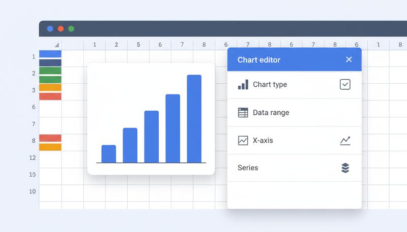
The Chart Editor Pane: Two Tabs, Two Different Jobs
The Chart Editor has two tabs, and understanding what each one does will save you from a lot of frustrated clicking.
The Setup tab controls what data is shown and how it's structured. This is where you:
- Change the chart type (column, line, pie, scatter, etc.)
- Set or adjust the data range — the cells your chart reads from
- Specify what goes on the X-axis (the horizontal axis, usually categories or time)
- Add or remove series — the individual lines, bars, or slices that represent your data
Think of Setup as answering: "What am I looking at?"
The Customize tab controls how the chart looks. This is where you:
- Add a chart title and subtitle
- Label your axes
- Change colors for bars, lines, or slices
- Adjust gridlines, fonts, and background color
- Configure the legend (show/hide, position)
- Add data labels directly on the chart elements
Think of Customize as answering: "How should it look?"
Here's a gotcha that trips up most people: spending twenty minutes in Customize trying to fix something that's actually a Setup problem. If your chart is showing the wrong data entirely, that's Setup. If your chart has the right data but the colors are dull and there's no title, that's Customize. Know the difference, and you'll save yourself a lot of frustration.
Choosing the Right Chart Type
This is where the real skill lives. Google Sheets offers a dizzying range of chart types, from basic columns and pies all the way to candlestick charts, org charts, and geographic maps. But for most everyday work, you'll spend 90% of your time with a much smaller set. Here are the ones worth knowing cold.
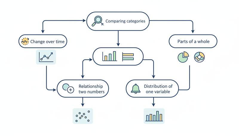
Column and Bar Charts: Comparing Categories
Column charts (vertical bars) and bar charts (horizontal bars) are the workhorses of data visualization. Reach for them when you're comparing distinct categories against each other.
- How much did each department spend this quarter?
- Which product sold the most units?
- How do my five largest expense categories stack up?
The key is that the categories are separate, distinct things — not a progression over time, not a relationship between two numbers. You're simply asking: "Which one is biggest?"
Use a column chart when your categories have a natural left-to-right order (months, regions, product lines). Use a bar chart when your category labels are long — horizontal bars give those labels more breathing room, which makes them easier to read.
Tip: When you have more than 8-10 categories, column charts get cramped and hard to read fast. Consider whether you can group or filter the data first, or switch to a horizontal bar chart which handles long lists more gracefully.
Line Charts: Showing Change Over Time
Line charts are for continuous sequences — data where the connection between one point and the next actually means something. The most common example is time: weekly sales, monthly temperatures, daily step counts.
The line itself is the message. It says: "here is a journey." The slope tells you whether things are going up or down. The shape tells you whether the change is gradual or sudden. Flat sections tell you when things stalled.
Use a line chart to show trends or data over a time period. If your X-axis is anything other than time (or some other genuine sequence), think twice — connecting unrelated categories with a line implies a relationship that doesn't exist.
One practical advantage: if you have multiple overlapping series (say, this year's expenses vs. last year's, month by month), a line chart handles that beautifully. Multiple lines on the same chart make comparison intuitive.
Pie and Donut Charts: Parts of a Whole (Use Carefully)
Pie charts show how a whole is divided into parts. They answer: "What percentage of the total does each category represent?" A budget where housing is 40%, food is 25%, transportation is 15%, and everything else accounts for the rest — that's a natural pie chart.
But here's when pie charts actually work:
- You have 5 or fewer slices (ideally 3-4)
- The differences between slices are visually obvious — not 22% vs. 24% vs. 26%
- Your audience cares about proportion, not exact values
And here's when they fail spectacularly:
- You have many small categories that create a confusing mess
- The slices are all roughly the same size, making comparison nearly impossible
- You're trying to compare one pie chart to another pie chart (humans are surprisingly bad at comparing angles across two separate circles)
A donut chart is basically the same thing with slightly better aesthetics — the hollow center gives you space to add a label or total. It's a reasonable default if you do want a pie-style chart.
Warning: Resist the urge to use a pie chart just because it "looks nice." If you end up with a pie chart that has 8 slices where half of them are grouped as "Other," it's time to switch to a bar chart instead.
Scatter Plots: Exploring Relationships
A scatter plot is fundamentally different from everything above. Instead of one variable on one axis, you have two numeric variables — one on each axis — and each data point is a dot placed at the intersection of its X and Y values.
The question a scatter plot answers is: "Is there a relationship between these two things?" Do students who study more hours tend to score higher? Do cities with higher temperatures sell more ice cream? Do longer meetings produce less productive outcomes? The dots will cluster diagonally if there's a strong relationship, or scatter randomly if there's nothing there.
Scatter plots are less common in everyday spreadsheet work, but when you have two columns of numbers and you want to know if they're related, they're exactly the right tool.
Histograms: Understanding Distribution
A histogram looks like a bar chart, but it's answering a completely different question. Instead of comparing distinct categories, a histogram shows how a single dataset is distributed — how often values fall into different ranges (called "buckets" or "bins").
Say you have test scores for 100 students. A histogram would group those scores into ranges (50-60, 60-70, 70-80, 80-90, 90-100) and show you how many students fell into each range. The resulting picture tells you whether most students clustered around 75, or whether scores were spread evenly, or whether there are two distinct groups performing very differently.
Histograms answer: "How is this data distributed?" They're useful whenever you have a collection of individual numeric values and you want to understand the shape of that data at a glance.
Here's a quick reference guide to help you choose:
Configuring Your Data Range Manually
Sheets' automatic chart detection is impressive, but it's not magic. When your data has an unusual structure — multiple header rows, blank columns, non-contiguous ranges — the auto-detection can stumble and produce something that doesn't make sense.
When that happens, don't panic. Go to the Setup tab in the Chart Editor and set things up manually.
Data Range: This field specifies all the cells your chart should read from. You can type it in directly (e.g., A1:C13) or click the grid icon to select it visually. If your relevant data lives in two separate columns with other stuff between them, you can specify multiple ranges separated by commas: A1:A13,C1:C13.
X-axis: This tells Sheets which column contains your category labels or time labels — the things that go along the bottom of the chart.
Series: These are the columns of numeric data you're charting. You can add multiple series (for a multi-line or grouped bar chart), remove series you don't want, and reorder them.
Here's genuinely useful advice: when auto-detection gives you a mess, start fresh. Clear all the series and build them up manually, one at a time. It takes an extra two minutes and saves you twenty minutes of frustrated troubleshooting.
Remember: The X-axis field and the Series fields are separate things. The X-axis is your labels; the Series are your numbers. If Sheets is plotting your category names as data points, something ended up in the wrong field.
Customizing Your Chart: Titles, Labels, Colors, and More
A chart with no title is like a document with no heading — technically functional, but requiring the reader to do extra work to understand what they're looking at. The Customize tab is where you add the context that makes your chart self-explanatory.
Chart and Axis Titles
Open the Chart & axis titles section in the Customize tab. Here you can set:
- Chart title: What is this chart showing? Be specific. "Monthly Expenses 2024" is better than "Expenses." "Marketing Spend by Region (Q3)" is better than "Marketing."
- Chart subtitle: Optional, but useful for adding context like "in USD" or "based on survey of 200 respondents."
- Horizontal axis title: What does the X-axis represent? "Month," "Category," "Product Name."
- Vertical axis title: What does the Y-axis represent? "Amount (USD)," "Number of Sales," "Hours."
These seem like small details, but they're the difference between a chart that communicates clearly and one that makes the reader cross-reference your spreadsheet just to understand what they're looking at.
Colors
Under the Series section in Customize, you can change the color of each series. A few practical thoughts:
- If you're presenting to others, choose colors with enough contrast to be readable in print and accessible to people with color vision differences. Blues and oranges are a classic safe pairing.
- If your chart represents categories where color has intuitive meaning (green for profit, red for loss), use it — your reader's brain will thank you.
- Resist the urge to make every bar a different color just because you can. Same-color bars with labeled categories are often cleaner than a rainbow.
Gridlines and Legends
Gridlines help readers trace a bar or point back to an axis value. They're on by default and usually worth keeping. You can adjust their frequency and color under Gridlines and ticks in the Customize tab.
The Legend section lets you show, hide, or reposition the legend. For charts with a single series, consider hiding the legend — it's not adding information. For multi-series charts, make sure the legend is visible and placed where it doesn't obscure the data.
Data Labels
Data labels print the actual numeric value directly on each bar, line point, or slice. They're incredibly useful when the exact value matters — like a budget breakdown where you want people to see "Housing: $1,200" rather than estimating from the axis. Find this under Series in the Customize tab, then check "Data labels."
The tradeoff: too many data labels on a dense chart create visual clutter. Use them when precision matters and there's enough visual space.
Moving Your Chart: Embedded vs. Its Own Sheet
When you first create a chart, it appears as a floating object on your spreadsheet — embedded directly in the sheet alongside your data. You can drag it anywhere, resize it, and it lives right there with the cells that feed it.
But sometimes you want a chart to have its own dedicated space, especially for presenting or building dashboards. To move a chart to its own sheet:
- Click the chart to select it
- Click the three-dot menu (⋮) in the top-right corner of the chart
- Select Move to own sheet
This creates a new tab in your workbook dedicated entirely to the chart. The chart is now full-screen and much easier to present. The data still lives on the original sheet — you've just given the chart its own stage.
You can move it back the same way: three-dot menu → Move to sheet → select your original sheet.
You can also publish individual charts to the web — generating a shareable link or embed code. This is genuinely useful if you want to share a live, auto-updating chart with someone who doesn't have access to your spreadsheet.
Charts Update Automatically — That's the Real Magic
Here's something that delights people when they first discover it: when you change a number in your spreadsheet, the chart immediately reflects it. You don't have to rebuild anything. You don't have to refresh. It just happens.
That's because charts in Google Sheets aren't pictures of your data — they're live views of it. The chart is always reading directly from the cells you specified in the Setup tab. Update the source, the chart updates. Add a new row to your data range and extend the range in the chart setup, and the new data point appears on the chart.
This is what transforms a chart from a one-time export into a living dashboard. Your monthly expense tracker automatically shows the new month the moment you enter it. Your sales chart grows as you add more data. You do the work once, and the visualization maintains itself.
Practical Walkthrough: Building a Monthly Expense Chart
Let's put this all together with a real example. Suppose you've built a simple monthly budget spreadsheet with two columns:
| Month | Total Expenses |
|---|---|
| January | 2400 |
| February | 2100 |
| March | 2850 |
| April | 2600 |
| May | 2750 |
| June | 3100 |
Step 1: Select the data. Click on cell A1 and drag to B7 to select all the data including headers.
Step 2: Insert the chart. Go to Insert → Chart. Sheets will likely suggest a column chart, which is reasonable, but we want a line chart since we're showing change over time.
Step 3: Change the chart type. In the Chart Editor, go to the Setup tab. Click the chart type dropdown (it probably says "Column chart") and select Line chart.
Step 4: Verify the data. Check that "Month" is set as the X-axis and "Total Expenses" is listed under Series. If they are, you're good. If not, set them manually.
Step 5: Add a title and labels. Switch to the Customize tab. Under Chart & axis titles:
- Chart title: "Monthly Household Expenses, 2024"
- Horizontal axis title: "Month"
- Vertical axis title: "Amount (USD)"
Step 6: Clean up the aesthetics. Optionally, change the line color to something you like, verify gridlines are on, and decide whether you want data labels on each point. For a simple six-month chart, data labels work well.
Step 7: Resize and position. Close the Chart Editor and drag the chart to a spot that makes sense — typically below or to the right of your data table.
You now have a chart that tells a story at a glance: you can see that expenses dipped in February, climbed through spring and into June, and the shape of that trend is immediately clear in a way that reading the numbers never was.
Tip: If you later add July through December data to your spreadsheet, just re-open the Chart Editor, go to Setup, and extend the data range from B7 to B13 (or however far your data goes). The chart will instantly update to show all twelve months.
One Last Thing: Chart Honesty
One thing worth mentioning, because it's easy to do accidentally: charts can mislead even when the data is accurate, simply through the choices you make about how the chart is configured.
The most common example is the Y-axis that doesn't start at zero. If your expenses range from $2,100 to $3,100, and you set your Y-axis to start at $2,000, a small month-to-month variation will look like a dramatic swing. The data is accurate, but the visual impression is exaggerated.
Google Sheets sometimes does this automatically to "zoom in" on the data. Be aware of it. When you're exploring data yourself, a zoomed-in axis is fine. When you're presenting to others, make sure the axis range tells an honest story about the magnitude of the changes you're showing.
Charts are powerful precisely because they influence how people feel about data, not just what they know. Use that power thoughtfully.
You now have the tools to take any table of data and turn it into a visual that communicates clearly and updates automatically. In the next section, we'll move from working alone to working together — sharing your spreadsheet, collaborating in real time, and making sure your work is protected.
Only visible to you
Sign in to take notes.